Whether you’re a super fund, energy provider or retail outlet, you’re going to have a tremendous amount of data to share, and the challenge is to present it in a way that will engage your audience, not put them to sleep. Hello, infographics!
‘But what are infographics?’ and ‘How can they benefit my corporate reporting?’, we hear you ask. Allow us to clarify.
According to David McCandless, author of Information is Beautiful, “designed information can help us understand the world, cut through BS and reveal the hidden patterns underneath”. With this in mind, an infographic, also know as information design, has the ability to simplify complex data into engaging graphic outcomes. When you get down to brass tacks, the value of infographics is scientific. Research suggests human beings process visual information more efficiently than text – just see for yourself:

It turns out our brains are actually wired to understand information presented visually more rapidly, so why not take advantage of this in your corporate reporting?
Infographics can contribute a great deal to your corporate report, by increasing your audience’s engagement and comprehension. Take, for example, a business overview page: when presented as a plain body of text there’s a good chance your audience will gloss over it, if they read it at all. However, present this information in an engaging, graphic manner, using icons, call-out figures and colour, and suddenly you can create a sense of intrigue and hierarchy, where the most important information is highlighted for your audience. Not only will this improve comprehension and help deliver your key message to your audience, it will contribute to increased transparency and a positive brand impression. Can it get any better?
It can! The value of infographics doesn’t end with your corporate report – they translate equally well online. When shared through your social media channels, the engaging characteristics of infographics will not only provide you with extra reach, but can drive traffic back to your website.
Twelve Creative has a team of expert information designers whose keen eye for creativity is balanced by a high priority on data accuracy. We’ve helped clients from a number of sectors transform seemingly dry data into engaging infographics – take a look!
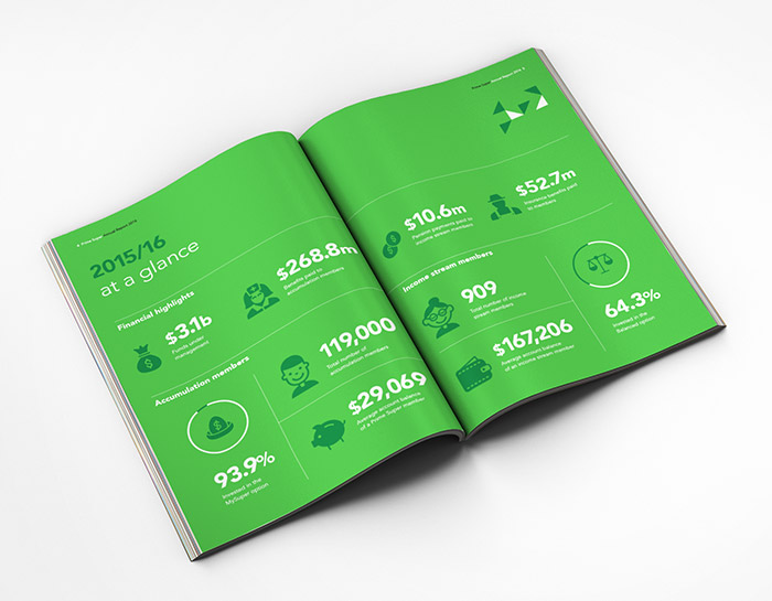
Prime Super Annual Report 2016
Use of icons and call-out figures presents a clear snapshot of Prime Super’s year at a glance.
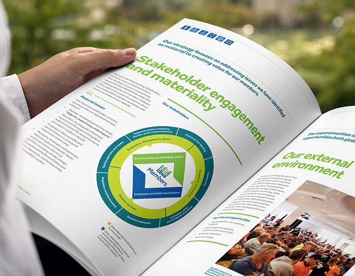
Cbus Annual Integrated Report 2016
This engaging diagram visualises the relationship between different stakeholders, and how they connect with Cbus.
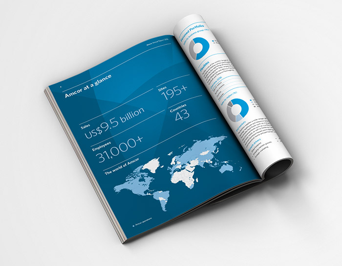
Amcor Annual Report 2016
Large call-out figures and a map quickly communicate key information to the reader.
