What could be more important than how (and why) your business generates value? Not only economic value, but intellectual, social and environmental value. Expressing your value creation process through infographics can help communicate this integral function of your business to both internal and external stakeholders.
What is a value creation diagram?
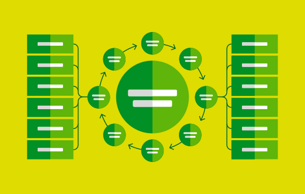
A value creation diagram describes how a business works and creates value. It can be produced with varying levels of detail, but will generally address how value is created for customers, employees and shareholders, as well as key stakeholders and the broader community.
The value creation diagram is a key deliverable in the integrated reporting framework (the international best practice standard in corporate reporting – more on that here). When aligned to the framework, it will break the value creation process down into financial, manufactured, intellectual, human, social and natural capital, resulting in a holistic view of the value creation process.
Value creation diagrams are also an opportunity to address the United Nations (UN) Sustainable Development Goals (SDGs).
According to the UN, “The Sustainable Development Goals are the blueprint to achieve a better and more sustainable future for all. They address the global challenges we face, including poverty, inequality, climate change, environmental degradation, peace and justice.”
With this in mind, the SDGs provide an ideal framework to help measure the effectiveness of your value creation process.
How does Twelve Creative produce a value creation diagram?
The first (and most important) step is collaborative. Twelve Creative engages the organisation’s key stakeholders in discussion, then researches their business model and takes a deep dive into understanding their value creation process.
Once Twelve Creative has a comprehensive understanding of the organisation or business, designers begin to design the value creation diagram.
There are a number of ways to visualise the value creation process, so the look and feel of the diagram is guided by the information gathered through research and stakeholder discussions. This culminates in a truly bespoke infographic.
Simplicity is key when designing a diagram. While your value creation process is complex and requires a lot of explanation, in-text referencing and further reading features can help simplify the diagram. At the same time, it provides readers with access to additional resources and explanations. Further reading can be housed elsewhere within a report or online. (Quick tip, a vanity URL is a must!)
The design then enters a critique and feedback stage where it is iterated until it accurately captures the business’ value creation process.
Examples of value creation diagrams
If you can’t tell already, we’re pretty keen on value creation diagrams. They serve a valuable purpose in corporate reporting, and we think we know a thing or two about designing them. But don’t just take our word for it – here are a few we’ve produced (and even won awards for).
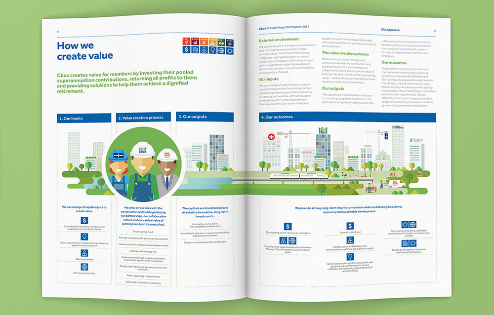
Cbus Annual Integrated Report 2017
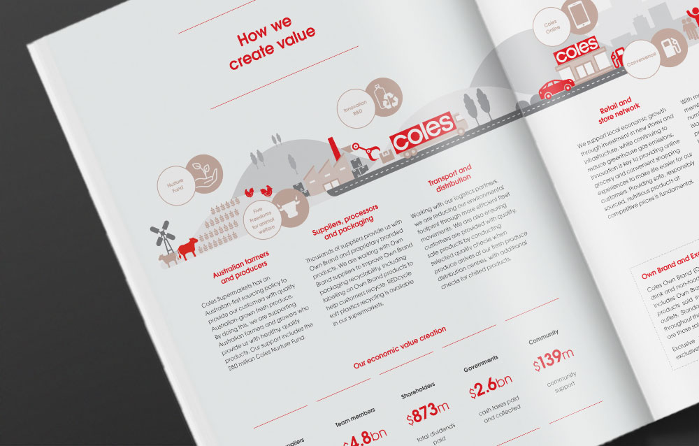
Coles Group Sustainability Report 2020
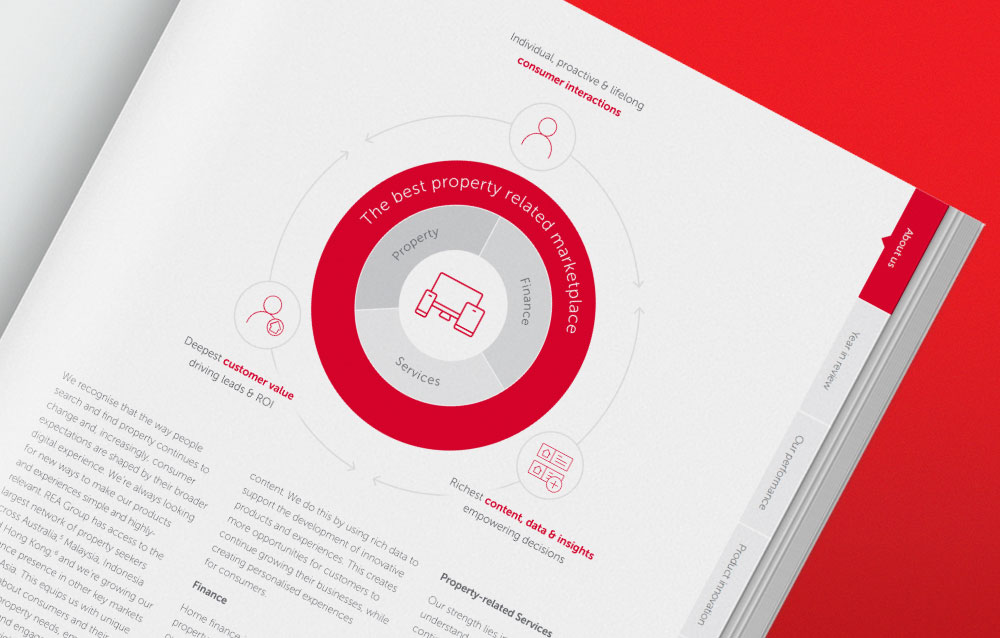
REA Group Annual Report 2019